Month: April 2013
Experimenting for funsies
Cool info flyer from Ludei
Yesterday, my roommate returned from a week-long trip of awesomeness. She went to San Francisco for the Game Developers Conference. She came back with a ton of free swag (t-shirts, LoL skin codes, dice, demo CDs of software, and other stuff) and flyers. Of those flyers, one from a company called Ludei really stood out. I’d never heard of them before but they definitely caught my attention in that massive pile of swag. The shape was interesting, the paper stock was worthy of attention, and the design communicated a decent amount of info in a small space. So I googled them. Ludei is a game tech company that provides tools (Cocoon and CocoonJS) to game developers, turning HTML5 games into iOS and Android applications. Cool! Just the type of thing my friend would be interested in. So I told him.
Never underestimate the power of a free flyer/info sheet. Especially at conferences, expos, and trade shows because you never know who might end up looking through the pile of free stuff and show their friends and spread the word.
p.s. that’s not my hand.
Meet the package designer of Arduino
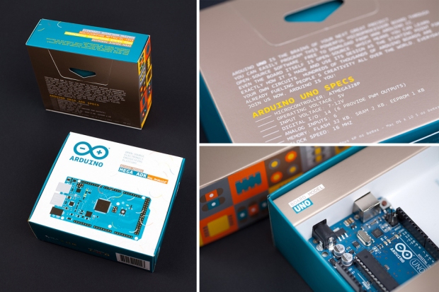
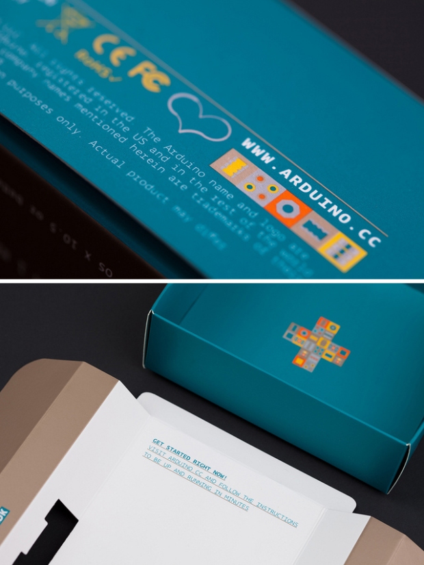
I bought my very first Arduino Uno a month ago (yay!! another post coming about my project using an LED cube and 3D tracking interface to create mini live performances). It was love at first sight. The box was beautiful! Alright, the little micro controller looks cool, too. But as a designer, the use of color and space in the overall retail design was eye candy! The packaging was designed by ToDo, an Italian design firm. The co-founder of Arduino actually asked his interaction design professor, Giorgio Olivero (founding partner of ToDo), to design the packaging. I’m melting just looking through ToDo studio’s Flickr photos of the packaging (images belong to them, I simply Photoshopped a few of them into collages. heh). What I’ve learned from purchasing an Arduino thus far (aside from writing a few sketches in Processing/Arduino IDE)? Study Italian design.

Detail shots of the package exterior. The colors contrast harmoniously, giving life and fun to a product so technical. The courier typeface makes this packing very friendly and accessible (despite monotype fonts’ bad rep for being less- aesthetically pleasing). It also plays up the tech aspect of the product, as monotype is ubiquitous in a programmer’s world.

Super detail shot. Iconic drawings in bright colors look soooo tasteful! Look at that detail even on the inside of packaging!


